


With hundreds of smartphone and smart devices around us, it is no surprise when statistics show that about 50% of web traffic is driven by mobile devices. Search engines are also favoring sites that are tailored for mobile devices.

If you are already convinced that you must have a mobile-optimized site, then you are presented with another dilemma of whether you need a responsive design or a mobile website. Here is an overview of both these techniques to help you choose.
Mobile Sites
In this type of approach, a separate site is created that is suitable for the small screens and hardware of mobile devices. When a user tries to access the site from a mobile device, the server identifies the device and redirects them to the mobile site.

This was the first solution introduced for mobile optimization and has its own advantages and disadvantages.
Advantages
- You can differentiate the content on the mobile and desktop sites. So you can optimize the content for mobile sites and make them more mobile-friendly.
- It provides a better user experience by providing mobile-specific controls.
Disadvantages
- The bi-directional annotation (redirecting to mobile sites based on a device) may cause complications for SEOs.
- The changes in the desktop site must also be reflected in the mobile site.
- You have to maintain two domains for the same site.
Responsive Design
Responsive web designs use code elements to alter the design of your website depending upon the device you use to access it. Essentially, a single website is made to adapt itself to the

environment in which it is used. Responsive sites adjust themselves to the display sizes in a fluid manner. The same content is delivered to both desktops and mobile devices.
Advantages
- It is easy to maintain, as it requires a single code base.
- It is easy to configure for SEOs, as a single URL is used.
- It is cheaper, as it does not require building two websites.
Disadvantages
- Large pages may load very slowly in mobile devices, as they do not have mobile-specific content.
- It does not provide a mobile-centric user experience.
How Do You Choose the Right Approach?
Both approaches are a good solution and the right solution depends on your needs and requirements. The table below provides a comparison of the two approaches, and it will give you an idea of what will be required for each approach.
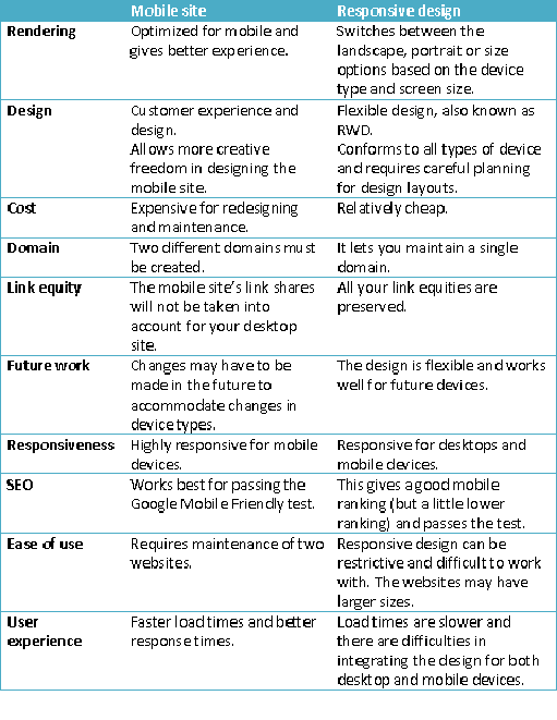
If you are not concerned with the costs and you want a mobile-centric user experience and a way to appeal to your mobile users, then you can choose mobile sites as your solution. But if you find maintaining two sites to be difficult and feel that a basic mobile friendly design is sufficient, then the responsive design is a good candidate. Whatever method you choose to apply for mobile friendliness, you should remember to hire the best developers to create a glitch-free smooth user experience. Your site must load quickly, be easy to navigate, have quality content and have a great user experience for it to be a success. Thus, which one do you use? Do you have any questions? Please feel free to leave your comments below and thanks for reading!


