


How should your website look? Today, with newer technologies coming in and user engagement being a key driver, companies are focusing on building just the right website design. In this quest, website development has just got a big leap and 2015 is host to some major developments. Website designing and development is a job that is constantly evolving. There are new trends every year, and some peter out, because they looked good only in theory; while others become so much a part of the Internet that it is difficult to imagine the Web without them. Here are the six biggest trends in website development in 2015:
-
Big and Minimalistic
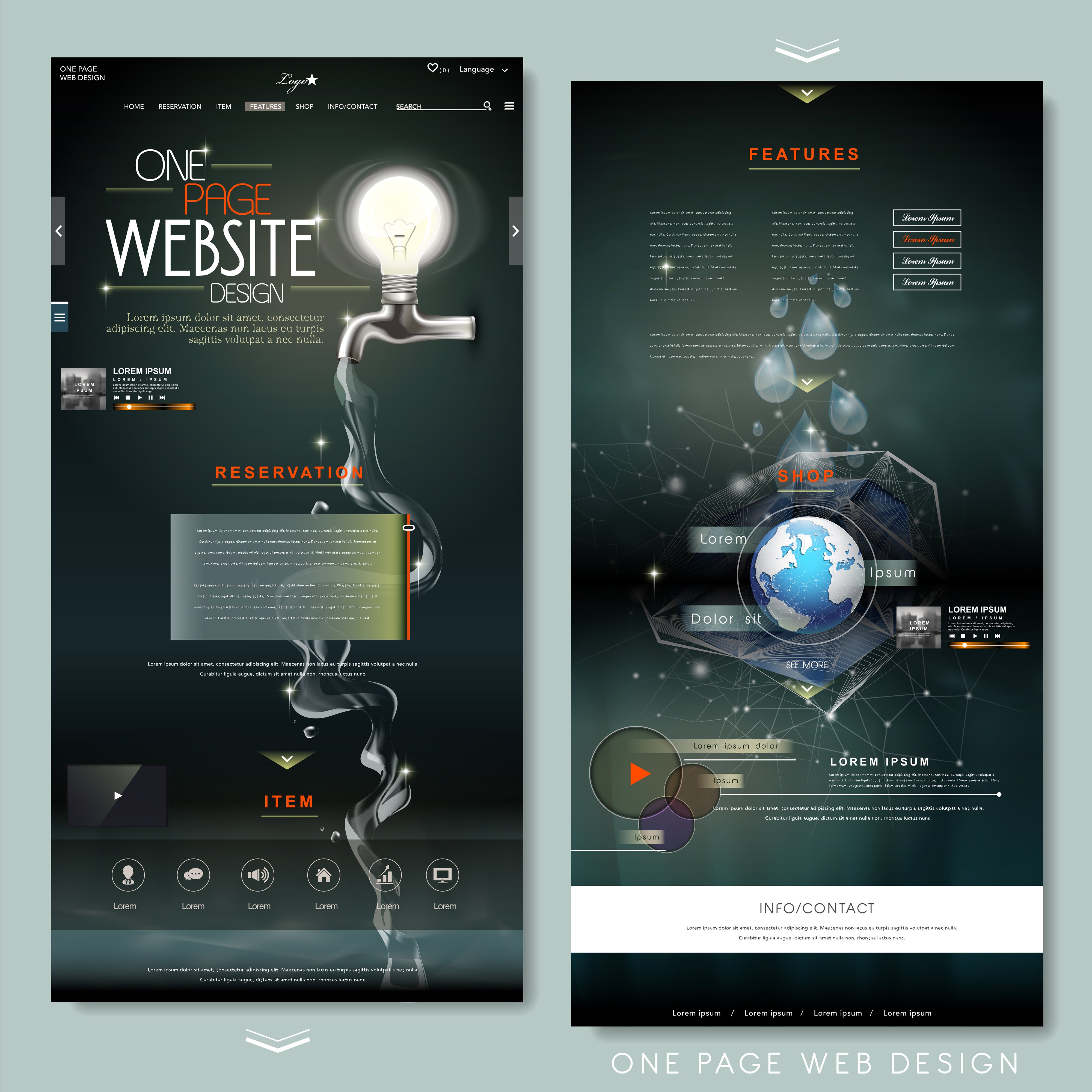
One of the most evident changes you will have noticed is that everything has become minimalistic and big. This change can be attributed partly to Apple, and partly to the trend towards going minimalistic. Today you will find websites have hardly a few words on their home page, with their menu buttons obscurely hidden away or taking up a very small screen space. The Google Nexus too pushed minimalism to another level of popularity. Unusual and clean fonts have also become the new big thing. A background of imagery or video under very few words seems to be the fad. Big is the new beautiful, clearly. One Page Website designs are in fact getting more popular today.
-
Integration and Customization of Google Maps
This trend has taken the industry by storm. Every website today has Google Maps integration. You can find the address or location of the business on their website through this integration. It is often customized to go with the theme and background of the website. This is a reflection of how our lives have actually become so internet-involved that we are just expected to want a GPS location. The customization is what makes this so interesting. You can expect the map to look completely personalized, and won’t even notice the Google Maps integration until you notice the small Maps logo in the corner, or if you are very familiar with the layout of Google Maps. It is convenience at its best.
-
Genuine Imagery
According to eyetracking studies by the Nielsen Norman Group, people tend to ignore artificial and cheesy photos. There was a time when you could find stock photos everywhere on the Internet. Now designers prefer photos of real people in candid poses. Genuine imagery is in. People don’t want to see photoshopped people, they want to see real people in real situations. This brings about a psychological connect with the brand too. Instead of finding perfect models in a boardroom, you are more likely to find real people mid-conversation, wrinkles and all, at the background of a website’s home page.
-
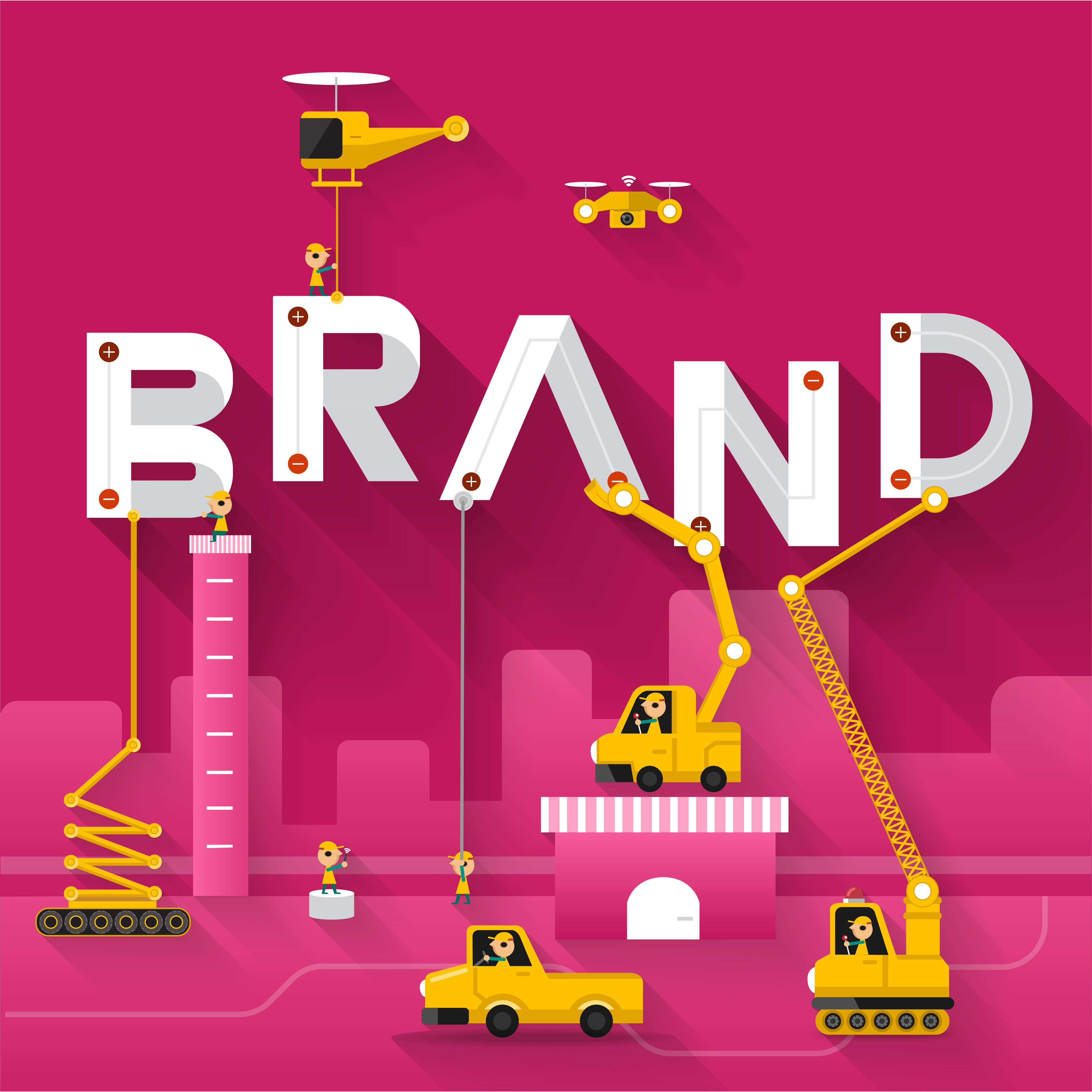
Digital-First Branding
The times of website branding playing second fiddle to real life branding are almost past us. Today many businesses are built and branded online first before they head into the real world, if at all. Logos are designed keeping the digital possibilities in mind. A good logo maker makes this easier by offering versatile, web-optimized designs that work seamlessly across digital platforms. The word branding no longer brings images of logo-branded coffee cups to mind, but instead websites that promote themselves through clean, clear, and connecting designs.
-
Mashup Interfaces
There were times when as much as possible was crammed into one home page. The fad for
cramming everything into one home page is still there, but with it so is the trend of being minimalistic. How do you reconcile these two trends? This can be done through mashup interfaces. There is one home page that has a very clean and modern look. The challenge lies in creatively fit functionality in one page. A mashup interface involves a lot of layers, each revealing more functionality and options. But the layers allow the overall look of the page to stay clean and minimalistic. Check out the Necotrans website to get an understanding of this.
-
Newer and Better Responsive Designs
Responsive design has been around for a long time now. Responsive design is a necessity in an era where people have browsers that coordinate their browsing over all the devices that they own. Responsive design allows a website to adapt to the device it is being viewed on. 2015 has seen a boom in wearable technology. The new responsive design will not only cater to smartphones and tablets, but also devices like the Apple Watch, Google Glass and Oculus Rift. Design frameworks like Semantic UI are the new buzzwords. The key is fitting on each screen, no matter how big or how expensive. Responsive design has new challenges lined up for it even in 2016.


